Bright Health
Bright Health
My role as a foundational member of the Bright Health team was leading the creation and development of the product design function. Navigating direct hires, acquiring a design and development partner, and incorporating external contractors gave me the opportunity to develop robust design operations that could adapt to the constant change and regulatory requirements of a nation-wide health organization. However, the most exciting part was working with cross-functional leadership to challenge the status quo and use technology to reshape traditional health insurance norms.
Static Messaging
to Rich Data
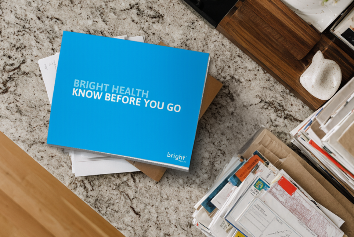
As a startup, Bright Health had a very small network of healthcare facilities and providers. The Know Before You Go campaign consisted of high quality printed materials meant to draw attention to the risk of out-of-network expenses. This traditional approach to member messaging was expensive, quickly outdated, and provided no clear data connection between the campaign and member outcomes. We worked with Marketing to Embrace Ambiguity and Simplify the campaign with technology.
Team
My Role
Product ownership, research strategy, design direction, design technology
Engineering
Research, UX design, UI design, design technology
Engineering
Product management, project management, market selection
Marketing
Content strategy, design collaboration
Engineering
Technical direction, engineering leadership, full-stack development
Timeline
Research
1 Week, then ongoing
Design
1.5 Weeks
Engineering
1 Month
Engineering
3 Months
Research Methods
Usage Statistics
Design Pattern Matching
Feature-Flagged Beta Testing

Design Decisions
Engagement through tech.
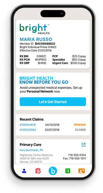
We transformed a generic, informational print campaign into a data-driven, personalized resource that members could access at any time with a computer or smartphone.
Low risk experimentation.
Tapping into the existing member portal to create an interactive version of the campaign was a low cost, low lift path to testing out the concept.
Stay in-network and on the app.
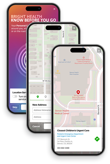
The onboarding process generated quick reference cards and maps that members could access whenever and wherever they needed.
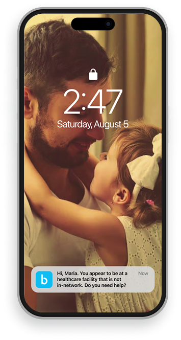
Collect and act on data.
Taking the campaign online gave us a wealth of new data about member engagement and behavior, as well as opportunities to intervene in real time if there was an out-of-network risk.
Outcomes
The total investment for the app was less than the cost of running the print campaign in one market for one year.
Member engagement and ROI for the campaign became measurable for the first time.
Engagement with the member portal increased > 20%.
Bright Health
Bright Health
My role as a foundational member of the Bright Health team was leading the creation and development of the product design function. Navigating direct hires, acquiring a design and development partner, and incorporating external contractors gave me the opportunity to develop robust design operations that could adapt to the constant change and regulatory requirements of a nation-wide health organization. However, the most exciting part was working with cross-functional leadership to challenge the status quo and use technology to reshape traditional health insurance norms.
Static Messaging
to Rich Data
As a startup, Bright Health had a very small network of healthcare facilities and providers. The Know Before You Go campaign consisted of high quality printed materials meant to draw attention to the risk of out-of-network expenses. This traditional approach to member messaging was expensive, quickly outdated, and provided no clear data connection between the campaign and member outcomes. We worked with Marketing to Embrace Ambiguity and Simplify the campaign with technology.
Team
My Role
Product ownership, research strategy, design direction, design technology
Engineering
Research, UX design, UI design, design technology
Engineering
Product management, project management, market selection
Marketing
Content strategy, design collaboration
Engineering
Technical direction, engineering leadership, full-stack development
Timeline
Research
1 Week, then ongoing
Design
1.5 Weeks
Engineering
1 Month
Engineering
3 Months
Research Methods
Usage Statistics
Design Pattern Matching
Feature-Flagged Beta Testing
Design Decisions
Engagement through tech.
We transformed a generic, informational print campaign into a data-driven, personalized resource that members could access at any time with a computer or smartphone.
Low risk experimentation.
Tapping into the existing member portal to create an interactive version of the campaign was a low cost, low lift path to testing out the concept.
Stay in-network and on the app.
The onboarding process generated quick reference cards and maps that members could access whenever and wherever they needed.
Collect and act on data.
Taking the campaign online gave us a wealth of new data about member engagement and behavior, as well as opportunities to intervene in real time if there was an out-of-network risk.
Outcomes
The total investment for the app was less than the cost of running the print campaign in one market for one year.
Member engagement and ROI for the campaign became measurable for the first time.
Engagement with the member portal increased > 20%.
Bright Health
Bright Health
My role as a foundational member of the Bright Health team was leading the creation and development of the product design function. Navigating direct hires, acquiring a design and development partner, and incorporating external contractors gave me the opportunity to develop robust design operations that could adapt to the constant change and regulatory requirements of a nation-wide health organization. However, the most exciting part was working with cross-functional leadership to challenge the status quo and use technology to reshape traditional health insurance norms.
Static Messaging
to Rich Data
As a startup, Bright Health had a very small network of healthcare facilities and providers. The Know Before You Go campaign consisted of high quality printed materials meant to draw attention to the risk of out-of-network expenses. This traditional approach to member messaging was expensive, quickly outdated, and provided no clear data connection between the campaign and member outcomes. We worked with Marketing to Embrace Ambiguity and Simplify the campaign with technology.
Team
My Role
Design direction, stakeholder alignment, cross-functional team management
Design
Research, UX design, UI design, design technology
Product
Product management, project management, market selection
Marketing
Marketing leadership, marketing research, content strategy, design collaboration
Engineering
Technical direction, engineering leadership, full-stack development
Timeline
Research
1 Week
Design
2 Weeks
Engineering
1 Month
Beta Period
3 Months
Research Methods
Usage Statistics
Design Pattern Matching
Market-Specific Beta Testing
Design Decisions
Engagement through tech.
We transformed a generic, informational print campaign into a data-driven, personalized resource that members could access at any time with a computer or smartphone.
Low risk experimentation.
Tapping into the existing member portal to create an interactive version of the campaign was a low cost, low lift path to testing out the concept.
Stay in-network and on the app.
The onboarding process generated quick reference cards and maps that members could access whenever and wherever they needed.
Collect and act on data.
Taking the campaign online gave us a wealth of new data about member engagement and behavior, as well as opportunities to intervene in real time if there was an out-of-network risk.
Outcomes
The total investment for the app was less than the cost of running the print campaign in one market for one year.
Member engagement and ROI for the campaign became measurable for the first time.
Engagement with the member portal increased > 20%.