< Select Projects
Finding a Workout
When we introduced FB Plus, we already had 600+ workouts available with hundreds more added over the next few years. From day-one it was clear that members were spending a lot of time looking for workouts. We could see long search sessions, rage clicks, and high abandonment rates in the data, but it wasn’t clear why. So it was the perfect time to Just Ask.
Research Methods
Surveys
Think Aloud Protocol Tasks
Focus Groups
Competitive Comparisons
Card Sorting
Screen Recording
Feature-Flagged Beta Testing
Usage Statistics
Design Decisions
1
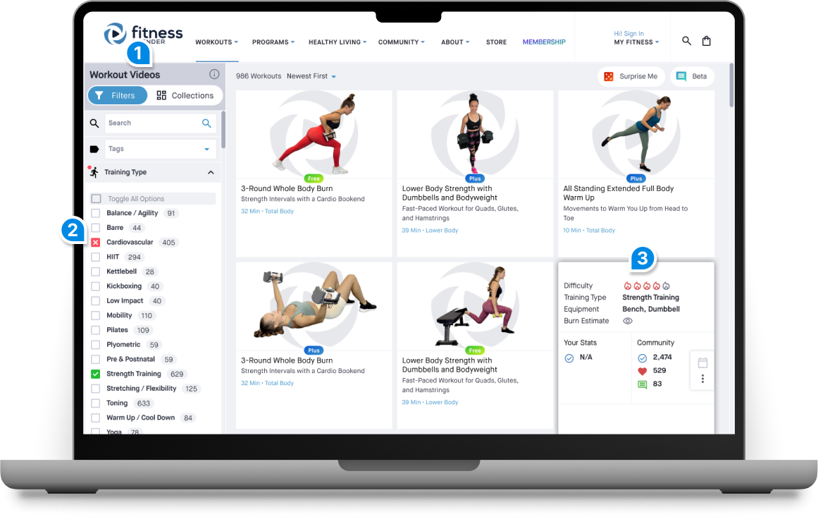
Don’t make me scroll to the top of the page to adjust my filters.
Taking cues from eCommerce design patterns, we opted for a fixed, vertical search and filter bar with accordion sections to replace an over-crowded horizontal menu.
2
I don’t want cardio in my strength training!
Members wanted to be able to include some criteria while specifically excluding others. Working with the engineering team, we designed an accessible tri-state checkbox to give users more fine-tuned control.
3
Can we see more details without going into each workout page?
A quick survey highlighted the key pieces of information members wanted to see at a glance. Tapping or hovering on a workout card revealed details without loading the video page.
Outcomes
Reduced average time to select or schedule a workout from 19 to 7 minutes.
Increased workout completion rate after selecting a workout by 37%.
Free member engagement in the beta periods led to 11% conversion to FB Plus.
Discovered an input issue leading to 100% reduction in reported rage clicks.
FB Plus Passes
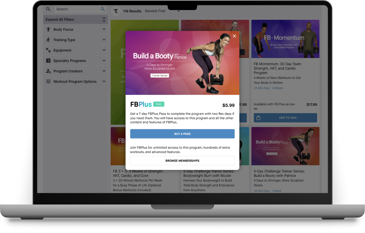
Fitness Blender’s first paid products were workout programs compiled from their free workouts. After the launch of FB Plus, the stakeholders wanted to switch programs from pay-once to a rental model, with the caveat that rental would include all features of FB Plus. The ask was simple, add a Rent Now button to programs. We knew the intent was to mitigate risk and increase recurring revenue so we asked the stakeholders to Embrace Ambiguity and let design provide alternative solutions.
Research Methods
Focus Groups
Competitive Analysis
Competitive Comparisons
Design Decisions
Is it a program rental or platform rental?
Although members found a recurring subscription that includes all programs valuable, they had very negative sentiment toward the notion of renting programs. We leveraged this viewpoint to create FB Plus Passes, focusing on the entire platform rather than individual programs.
Keeping the Rent Now spirit.
With the original ask top of mind, we used messaging and branding to connect a pass purchase with a program. This “soft” connection gave us the freedom to have unlimited pass and program combinations without direct systematic connections between products.
Offer flexibility at a premium.
Promoting passes for the new year and spring seasons allowed us to capture members with short term goals, willing to pay a premium for access only a few months out of the year.
Outcomes
Plus Passes became the second highest revenue stream in less than a year.
Increased FB Plus adoption in countries that don’t allow saved credit cards for recurring payments.
Generated more lifetime value from top pass purchasers than subscribers.
Data Visualization
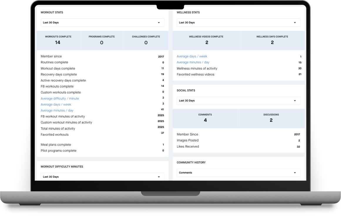
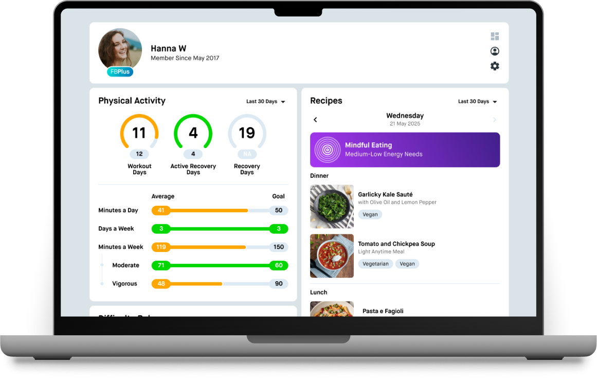
Lists and data points are notoriously difficult to present in a way that enhances meaning and engagement. So when it came time to give the massive list of data points on our activity dashboard a glow up, we knew we had to Simplify.
Research Methods
Surveys
Focus Groups
Usage Statistics
Feature-Flagged Beta Testing
Design Decisions
Reduce the noise to focus on what matters most.
It can be hard to streamline data, especially when both members and stakeholders think they want more. Ultimately, only displaying the most important information gave us the space to create bold visuals with more depth to the data.
Tie stats to measurable goals.
Allowing members to set activity goals gave us the ability to contextualize the raw data in a way that also encouraged overall engagement and personal achievements.
Beta Outcomes
Increased dashboard views while decreasing time spent on page.
Overall completion for workouts, wellness and recipes increased by 7% when regularly viewing activity.
Members who opted to turn off stats tracking reduced to less than 1%.
< Select Projects
Finding a Workout
When we introduced FB Plus, we already had 600+ workouts available with hundreds more added over the next few years. From day-one it was clear that members were spending a lot of time looking for workouts. We could see long search sessions, rage clicks, and high abandonment rates in the data, but it wasn’t clear why. So it was the perfect time to Just Ask.
Research Methods
Surveys
Think Aloud Protocol Tasks
Focus Groups
Competitive Comparisons
Card Sorting
Screen Recording
Feature-Flagged Beta Testing
Usage Statistics
Design Decisions
1
Taking cues from eCommerce design patterns, we opted for a fixed, vertical search and filter bar with accordion sections to replace an over-crowded horizontal menu.
Don’t make me scroll to the top of the page to adjust my filters.
2
I don’t want cardio in my strength training!
Members wanted to be able to include some criteria while specifically excluding others. Working with the engineering team, we designed an accessible tri-state checkbox to give users more fine-tuned control.
3
Can we see more details without going into each workout page?
A quick survey highlighted the key pieces of information members wanted to see at a glance. Tapping or hovering on a workout card revealed details without loading the video page.
Outcomes
Reduced average time to select or schedule a workout from 19 to 7 minutes.
Increased workout completion rate after selecting a workout by 37%.
Free member engagement in the beta periods led to 11% conversion to FB Plus.
Discovered an input issue leading to 100% reduction in reported rage clicks.
FB Plus Passes
Fitness Blender’s first paid products were workout programs compiled from their free workouts. After the launch of FB Plus, the stakeholders wanted to switch programs from pay-once to a rental model, with the caveat that rental would include all features of FB Plus. The ask was simple, add a Rent Now button to programs. We knew the intent was to mitigate risk and increase recurring revenue so we asked the stakeholders to Embrace Ambiguity and let design provide alternative solutions.
Research Methods
Focus Groups
Competitive Analysis
Competitive Comparisons
Design Decisions
Is it a program rental or platform rental?
Although members found a recurring subscription that includes all programs valuable, they had very negative sentiment toward the notion of renting programs. We leveraged this viewpoint to create FB Plus Passes, focusing on the entire platform rather than individual programs.
Keeping the Rent Now spirit.
With the original ask top of mind, we used messaging and branding to connect a pass purchase with a program. This “soft” connection gave us the freedom to have unlimited pass and program combinations without direct systematic connections between products.
Offer flexibility at a premium.
Promoting passes for the new year and spring seasons allowed us to capture members with short term goals, willing to pay a premium for access only a few months out of the year.
Outcomes
Plus Passes became the second highest revenue stream in less than a year.
Increased FB Plus adoption in countries that don’t allow saved credit cards for recurring payments.
Generated more lifetime value from top pass purchasers than subscribers.
Data Visualization
Lists and data points are notoriously difficult to present in a way that enhances meaning and engagement. So when it came time to give the massive list of data points on our activity dashboard a glow up, we knew we had to Simplify.
Research Methods
Surveys
Focus Groups
Usage Statistics
Feature-Flagged Beta Testing
Design Decisions
Reduce the noise to focus on what matters most.
It can be hard to streamline data, especially when both members and stakeholders think they want more. Ultimately, only displaying the most important information gave us the space to create bold visuals with more depth to the data.
Tie stats to measurable goals.
Allowing members to set activity goals gave us the ability to contextualize the raw data in a way that also encouraged overall engagement and personal achievements.
Beta Outcomes
Increased dashboard views while decreasing time spent on page.
Overall completion for workouts, wellness and recipes increased by 7% when regularly viewing activity.
Members who opted to turn off stats tracking reduced to less than 1%.
< Select Projects
Finding a Workout
When we introduced FB Plus, we already had 600+ workouts available with hundreds more added over the next few years. From day-one it was clear that members were spending a lot of time looking for workouts. We could see long search sessions, rage clicks, and high abandonment rates in the data, but it wasn’t clear why. So it was the perfect time to Just Ask.
Research Methods
Surveys
Think Aloud Protocol Tasks
Focus Groups
Competitive Comparisons
Card Sorting
Screen Recording
Feature-Flagged Beta Testing
Usage Statistics
Design Decisions
1
Don’t make me scroll to the top of the page to adjust my filters.
Taking cues from eCommerce design patterns, we opted for a fixed, vertical search and filter bar with accordion sections to replace an over-crowded horizontal menu.
2
I don’t want cardio in my strength training!
Members wanted to be able to include some criteria while specifically excluding others. Working with the engineering team, we designed an accessible tri-state checkbox to give users more fine-tuned control.
3
Can we see more details without going into each workout page?
A quick survey highlighted the key pieces of information members wanted to see at a glance. Tapping or hovering on a workout card revealed details without loading the video page.
Outcomes
Reduced average time to select or schedule a workout from 19 to 7 minutes.
Increased workout completion rate after selecting a workout by 37%.
Free member engagement in the beta periods led to 11% conversion to FB Plus.
Discovered an input issue leading to 100% reduction in reported rage clicks.
FB Plus Passes
Fitness Blender’s first paid products were workout programs compiled from their free workouts. After the launch of FB Plus, the stakeholders wanted to switch programs from pay-once to a rental model, with the caveat that rental would include all features of FB Plus. The ask was simple, add a Rent Now button to programs. We knew the intent was to mitigate risk and increase recurring revenue so we asked the stakeholders to Embrace Ambiguity and let design provide alternative solutions.
Research Methods
Focus Groups
Competitive Analysis
Competitive Comparisons
Design Decisions
Is it a program rental or platform rental?
Although members found a recurring subscription that includes all programs valuable, they had very negative sentiment toward the notion of renting programs. We leveraged this viewpoint to create FB Plus Passes, focusing on the entire platform rather than individual programs.
Keeping the Rent Now spirit.
With the original ask top of mind, we used messaging and branding to connect a pass purchase with a program. This “soft” connection gave us the freedom to have unlimited pass and program combinations without direct systematic connections between products.
Offer flexibility at a premium.
Promoting passes for the new year and spring seasons allowed us to capture members with short term goals, willing to pay a premium for access only a few months out of the year.
Outcomes
Plus Passes became the second highest revenue stream in less than a year.
Increased FB Plus adoption in countries that don’t allow saved credit cards for recurring payments.
Generated more lifetime value from top pass purchasers than subscribers.
Data Visualization
Lists and data points are notoriously difficult to present in a way that enhances meaning and engagement. So when it came time to give the massive list of data points on our activity dashboard a glow up, we knew we had to Simplify.
Research Methods
Surveys
Focus Groups
Usage Statistics
Feature-Flagged Beta Testing
Design Decisions
Reduce the noise to focus on what matters most.
It can be hard to streamline data, especially when both members and stakeholders think they want more. Ultimately, only displaying the most important information gave us the space to create bold visuals with more depth to the data.
Tie stats to measurable goals.
Allowing members to set activity goals gave us the ability to contextualize the raw data in a way that also encouraged overall engagement and personal achievements.
Beta Outcomes
Increased dashboard views while decreasing time spent on page.
Overall completion for workouts, wellness and recipes increased by 7% when regularly viewing activity.
Members who opted to turn off stats tracking reduced to less than 1%.